As a part of the Ivey Product Society this term, I was excited to work on Google Cloud Skillboost Platform, because I have always been passionate about making the platform more accessible, easy to use, and engaging with students.
Problem Identification
After having organized a workshop at Maple Hacks, a hackathon at Western, I noticed some significant user experience challenges:
- High turnover during sessions due to non-intuitive interface
- Complex signup process requiring navigation through multiple pages
- Limited integration with existing Google Developer communities
Proposed Solutions
My analysis focused on several key improvements:
Community Integration
- Integration of forums and community groups within the learning platform
- Seamless connection with GDSC, GDG, and GDE communities
- Strategic placement of hyperlinks for better navigation
Gamification and Recognition
- Synchronization of badges with developer profile points system
- Enhanced reward system for completed learning paths
User Interface Improvements
- Streamlined signup process
- More intuitive navigation
- Better integration of learning resources
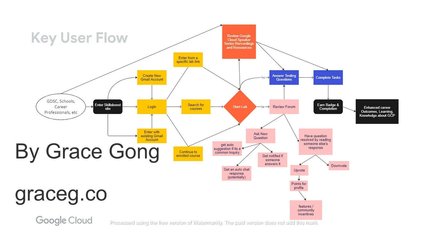
User Flow Design
*Detailed mockups and user flow diagrams available upon request*Full Documentation
The complete Product Requirements Document (PRD) and slide deck are available upon request, containing:
- Detailed user research
- Complete feature specifications
- Implementation recommendations
- User flow diagrams
- Interface mockups
Looking Forward
These improvements aim to create a more engaging and accessible learning experience for students using the Google Cloud Skillboost Platform.
💫 If you enjoyed this piece, please consider sharing it with a friend and subscribing to my newsletter below to get updates on new blogposts!
